MET MY FAVORITE TROCK, JOSHUA GRANT, LAST NIGHT

…after the Fall For Dance finale in the FFD lounge.


Top photo from the Trocks’ website; bottom photo (Grant is in back) by Sascha Vaughn, courtesy of City Center.

I was actually pretty proud of myself for recognizing him without his makeup on! After seeing them perform in the festival last weekend — they were my favorites from Program 3 — I did some research, particularly on Grant / aka Katerina Bychkova and found this interesting article, which happened to contain the only photo I could find of the guys not in costume (scroll down, on the right side); it wasn’t hard to figure out which one was him.

Anyway I was with my friends Michael and Taylor in the FFD lounge and, when I noticed him walking around I pointed him out to them. Michael initially wouldn’t believe me that he was the “big guy” — it’s really crazy how dancers DO always look so much smaller in person!! — but I was pretty sure. So of course outgoing as he is, Michael was soon off to confirm whether I was correct! After he did so, he made me and Taylor (both of us very very shy) go over and talk to him and some of the company people at his table.

And I’m happy we did. Mr. Grant was sooo nice! I love it when favorite dancers are all warm and fuzzy ๐Ÿ™‚ He’s the type of guy you feel like you could talk to forever.

Anyway, I liked all of the dancers — all of whom have superb classical technique and of course immense acting skills — but because Grant is the largest and had a main role, he stood out, and his body is naturally the most subversive for this kind of gender parody. At the festival, they performed Go For Barocco, one of the troupe’s earliest ballets, from 1974, a light spoof of several Balanchine ballets, including Concerto Barocco, after which the ballet is named. Here are some clips of it (which Grant isn’t in; he’s too new to the company):

I love their intentional humor — the way they present pretty, innocent ballerina faces to the audience but then get into little cat-fights with each other — but I also think in a way it’s more subversive when they dance seriously, especially when they dance Balanchine, who idolized / objectified women in so fervently declaring that “ballet is woman.” Ballet to him may have been woman, but of course one with a certain body type. When they do that, what I call a “group grapevine” so ubiquitous in Balanchine ballets (clip one around the 4:42-4:57 mark), of course their bodies are going to get all twisted around each other; that weaving in and out of each other in complicated patterns requires skinny, lithe little bodies. And those kind of showgirl-ish “strutting hip juts” (clip one: 3:56-4:12)– they don’t even need to give them any oomph; with their male bodies, they’reย  going to look different, and funny in a way you never noticed on, for example, the ballerinas in “Rubies.” I just can’t stop laughing at the 5:18 point on clip one — it’s so Balanchine taken to a hilariously ridiculous extreme. And I love the wrapping of the hands atop each other (clip two: 2:21-3:01) that here takes on lesbian undertones, which in Balanchine’s similar patterns and gestures looks innocuously sweetly girlish. They mean everything in good fun, but because it’s not completely off the wall, it makes you think, it makes you see things in a different way.

Anyway, unbelievably I haven’t seen this troupe since college. I don’t know how I’ve missed them all these years in New York but I’m definitely going to see them more often now.

More Fall For Dance reviews coming this week.
JUDGING A BOOK BY ITS COVER

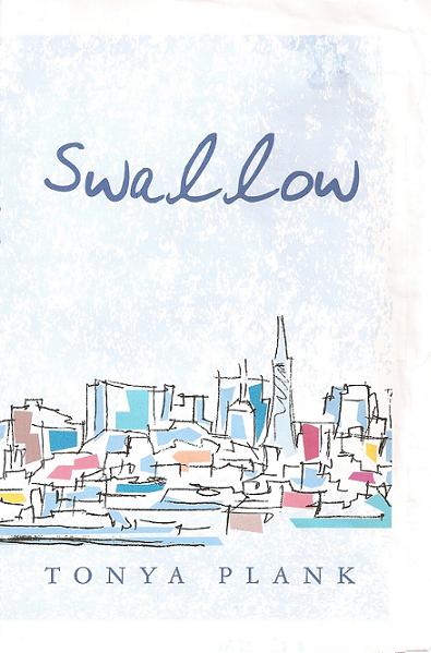
scan0005

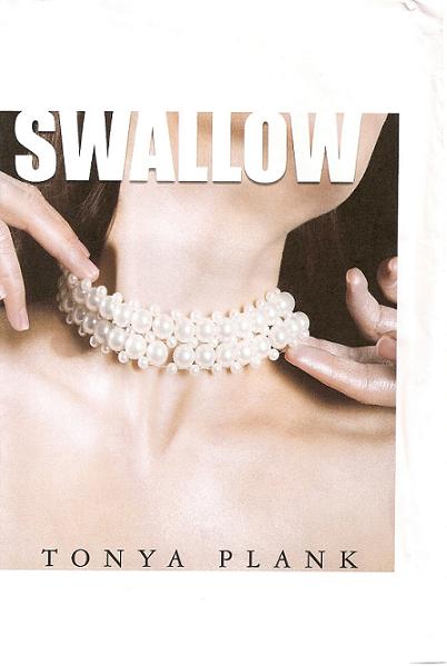
Sorry posting has been kind of lame over the past week. I’m working really hard on finishing the final read-throughs of my novel and, as always, it’s more involved than I expected. I have several exciting Fall For Dance programs still to write about — a puppet-performed Petrushka, Bronislava Nijinska’s Les Biches, the fabulous Trocks, Dance Brazil’s unique capoeira / samba / modern blend, Tiler and Gonzalo ๐Ÿ˜€ , the best Afternoon of a Faun (involving two fauns actually) I’ve ever seen — this is by far the best FFD Festival I can remember — and I plan to write about it all at the end of the weekend or early next week; after, hopefully, I’ve finished my rewrites.

In the meantime, above is my final cover. Took me forever to okay something I was happy with. At first I was going to go with this one:

scan0006

But then I had dinner with a gay male friend, who said of this bottom one, “Okay. This looks like it’s about a girl who goes around New York giving blow jobs.”

Which my novel is NOT about! I sought others’ opinions — nearly drove all of my friends crazy — and most people agreed that, since it’s about a young woman with a disorder, the cover should indicate that. It’s just that the disorder she develops is due in part to her moving into the city — a city she feels largely alienated by — and so it’s partly about her ability to make her own home here. Which is why I thought an arty cityscape would work.

But apparently not with this title!

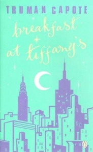
breakfast-at-tiffanys

I’d gotten the idea for the arty cityscape cover from my favorite Breakfast at Tiffany’s edition.

I also love this cover, for Charles Jackson’s The Lost Weekend:

the-lost-weekend-lg

This is as large as I could blow it up, but it’s one of my very favorite covers. I’d asked my design team to come up with something similar (with a woman looking into the abyss), and they couldn’t. I showed a friend and she kind of burst out laughing and told me I’d need to hire an artist to make me something wholly original if I wanted something approaching it. I have that Lost Weekend edition (which I found at a rare bookstore in Durham, NC) and the cover is an actual piece art — it’s actually painted onto the cover, which is made of a sturdier material than regular covers — the result being that once the years go by and the cover ages, you literally can’t open the book without breaking it. So, the irony is that that book is unreadable; it must simply sit on my bookshelf facing out, to showcase the piece of visual art that it’s now solely become.ย  In any event, even if I did want a book that could only be enjoyed for its cover, I don’t have the money to hire my own artist.

But I think my design team came up with something that works anyway.

My biggest problem with having a photo of a woman on the cover is that I was afraid it’d be taken for Chick-lit, a moniker I think every female writer has some kind of issue with, or at least thinks about. I thought an illustration would make it look like it’s about art — which it partly is: one of the protagonist’s friends is an artist and he’s an important character. And I thought a photo of a woman would alienate male readers. But then a friend who works as an artistic director of a magazine said illustrations don’t sell; you gotta have a photo, which she insisted was pertinent to books as well as magazines (and she has two published books of her own out). She’s one of four or five people (as I said, I drove all of my friends stark raving nuts) who helped me come up with the idea for my final cover.

…which I’m happy with — I think it hints at what the book is about and is dramatic and somewhat provocative without being over the top. I just hope it doesn’t alienate potential male readers. But then, as practically everyone I know (of both sexes) have told me ad nauseam, men don’t read anyway — especially fiction; women read and Chick-lit sells. So just embrace it.

Anyway, there are many other issues involved in the whole Chick-lit quandary, and in book cover art, but I’ve blabbered for too long. Have to get back to my rewrites… And I need to go out for my Friday cupcake.

Have a good weekend everyone!